7 min read
Why Prints Look Different in Autumn and Winter: Understanding Colour Perception
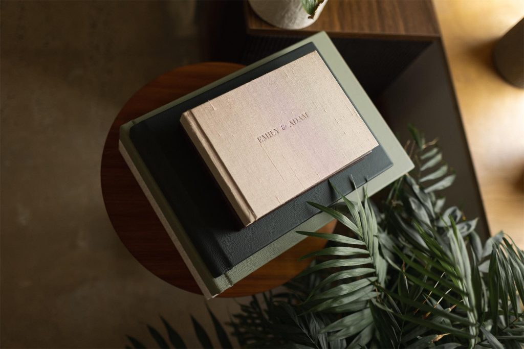
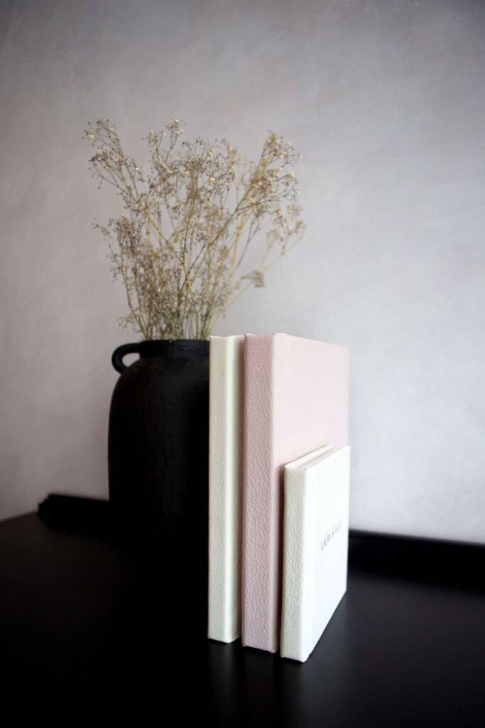
As the seasons shift and natural light fades, photographers often notice their prints looking warmer or more orange than expected. This isn’t a printing fault, but rather how human vision interacts with different light sources. Unlike screens, which emit light, prints reflect it—meaning their appearance depends heavily on the lighting around them. In this article, we’ll explore why prints can appear different in autumn and winter, and how understanding colour temperature can help you guide clients with confidence.